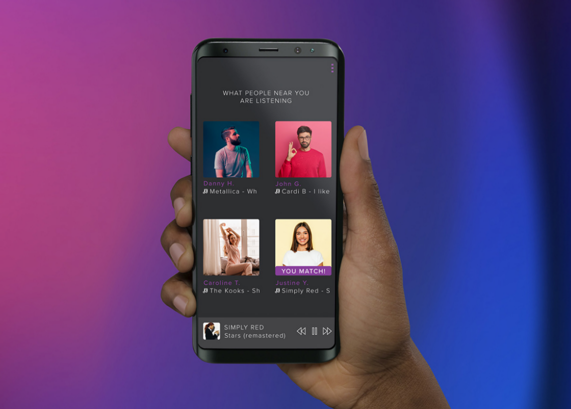
This was a designed project for a music app that matches people accordingly to their music taste. After COVID hit the world, many people felt isolated. Social media and social apps became some of the few contacts with the world.So why not give this opportunity to bring people together through their music taste?
As a UX designer, I asked people to fill a google form in regards to how they would feel about having such app. The results were the following:
🧪Analysis
Review data that was gathered from the Form
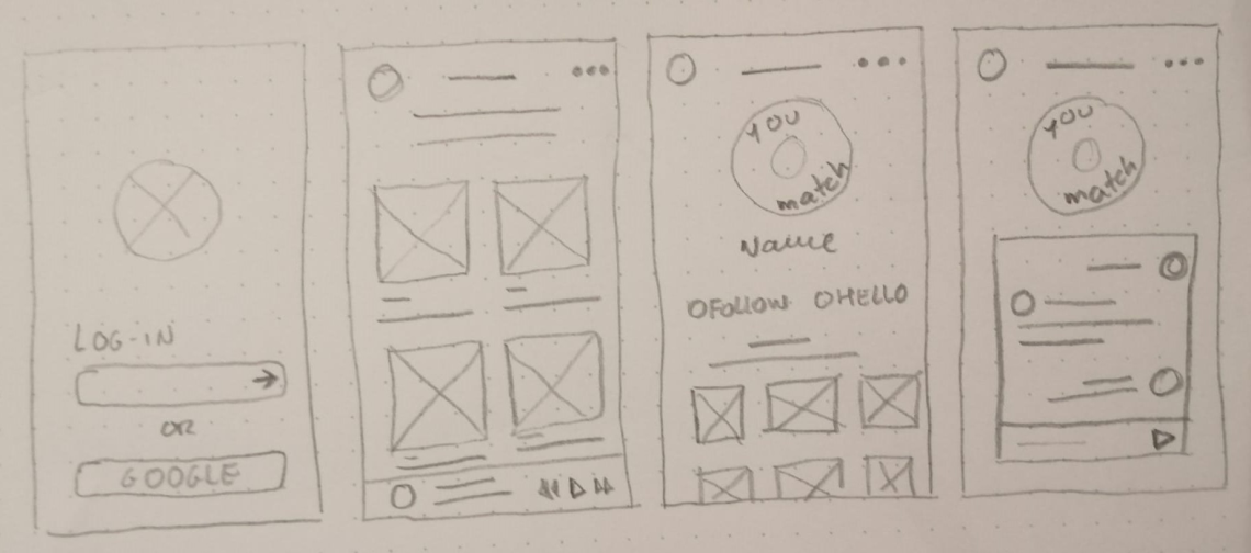
🖼️Wireframes
Design paper wireframes for the application
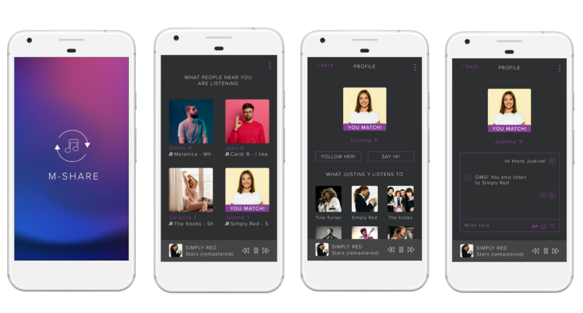
✏️Lo-fi
Design from wireframes and choose assets
🎨First Prototype
Develop a prototype for users to test it


The app is not a final product, although it was tested by 3 external persons to the project. Comments gathered were overall good and the app was liked by everyone. Some users said that they wish the app had a bigger contrast and that it had a light-mode option. One user refered that social media profiles should be added to the app, altough it was later contested by another user who said "that people should be able to have control over who they sahre their social media profiles with".